Tuesday, October 17, 2017

Development on topic and research

As a part of my primary research I want to find out why books are chosen to be republished. To find this out I thought I emailed Coralie Bickford Smith who works for penguin to see if she could help. She said she would forward me email to her editor who deals with the classics, so now I am waiting to see if I get a reply.

Research

One of the first re organising of penguin was in early-mid 1960's. The idea was to group together new and scholarly editions of literary classics of the nineteenth century and earlier, quite a number of which had already been issued in the Penguin main series.

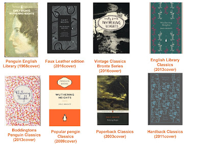
Wuthering Heights original penguin cover was published in 1968 since then penguin has published this book with different covers many times. I am struggling to find all penguin covers however I found at least 7 covers between 2003 and 2016. I want to look at some of these covers within my essay.


Monday, October 16, 2017

COP3 Presentation

 This is the question I came up with for my dissertation.
The theme will be Penguin book cover design. The reason I am doing this is not only because I love books but also because I am amazed by the success of Penguin and how they are able to redesign a cover of the same books and sell them over and over again.
 I wanted to look at the modernisation and development of the classic collection.
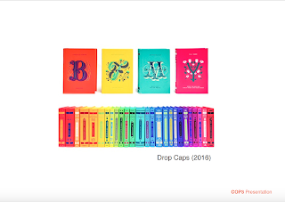
 I found some 2016 collections that I found were successful.


 There is a lack In academic writing on Penguin covers however I found two books that would be helpful.
 Due to the lack of books I think its important to include primary research.
I also had a idea of a final outcome which was to design a collection were the books all have strong female protagonists.


Feedback
After my presentation it was said that my question was two long so I have changed it to 'How have Penguin adapted and changed the designs of their classic covers to stay relevant' My ideas of content were also changed as it would be more beneficial to choose one book and look at all its covers rather than whole collections. This has changed the idea of the outcome, which I am still thinking about. I want to start primary research by trying to find out why books are chosen to be republished.




Thursday, April 20, 2017

Design Boards COP 2


Photography posters

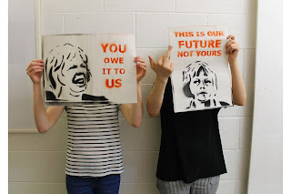
Overall I feel that my posters can work well within protests due to there bold message which is easy to read and understand. Also it is able to be created with mass distribution which makes it accessible. There is also some humour added to the designs with the different expressions of Theresa May going from a cry to a evil stare. This could make people want to take photos of the images and share on social media. 


Wednesday, April 12, 2017

Spray Painting material


I decided to spray onto material to see how It would look and I felt it worked well. My design could always be blown up big and made into a bigger stencil and put onto material to make big banners that could be hung from building and marched with.

Spray Painting News Print

As Newsprint is one of the cheapest stocks I thought it would be best for mass production with student value. However as it is thin you have to be careful holding the spray paint far away and not putting it on to thick or the paint bleeds out becomes harder to read. But overall newsprint worked well for the posters and I created around 40 posters in 20 minutes. The stencils would be easy to take places and spray designs onto any material on the go.


COP Critique

I felt I was at the stage where I needed some feedback therefore I asked a few people there opinions on my work. This was the feedback.
  • I don't need to state 'Student Voice' because it will be obvious in the context it would be used which is being carried by students within a protest. 
  • They were not a fan of the coloured backgrounds as they were overpowering and suggested I stick to coloured type 
  • They said I would need Strong images and that I would need to simplify as what I had would be to hard to stencil so it would need to be more basic.
  • My final poster outcomes should be photographed with students holding them so they can be seen more in context
  • Maybe I could think about Lino prints
  • Newspaper print is cheap for mass production and maybe spray onto walls
  • Look into Guerilla Art
  • Maybe take inspiration from caricatures of famous people for my images
  • Make sure it is accessible 
Overall I got some good feedback, I won't be looking into Lino as I feel that spray paint is better for mass production however I will develop my colours more and I like the idea of newsprint as stock. I will take off the student voice text as it is not needed and will make the stencil more simple and impactful.

Monday, April 10, 2017

Creating stencils


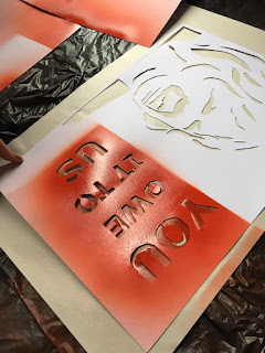
For my final designs I created the shapes and stencil type on illustrator and printed it out. I paper cut the designs onto card and that was my stencils created. This was easy and cheap to do and can create thousands of posters. I decided on the colours of Black and red as they stand out and add to the no nonsense feel of protests. 


Sunday, April 9, 2017

collecting images developing ideas

 Creating my stencils I want to use the face of Theresa May who is now the prime minister and is the person who puts forward Article 50. Some campaigns and artists I am taking inspiration from for my idea is the Obama Hope poster by Shepard Fairey and the Che Guevara poster by Jim Fitzpatrick both created by using a famous photographed image but manipulating it to create something of their own. Such image appropriation has proved to be vastly successful in the past.


I created some images of Theresa May with different facial expressions as ideas of what I could have on my poster. I added text using the information I collected of what people would like to say to Theresa May. I developed the images and text into layouts looking at what colours would be most impactful. Following a small critique I was told that my posters looked like Theresa May was saying the things and not students so I added the part that said student voice to make that clearer.
I want to get some feedback on the work I have developed so far.


Thursday, April 6, 2017

1968 student protests


As my protest posters are going to be the voice of students I am looking more into the student protests that occurred in France in 1968. They were protesting against the increasing rise in unemployment and poverty. There was many anonymous posters produced and used in protest. 

In Paris, on the 16 May, students and faculty staff took over the Ecole des Beaux Arts to establish the Atelier Populaire (the Popular Workshop). The organisation went on to produce hundreds of silkscreen posters in an unprecedented outpouring of political graphic art. In a statement, the Atelier Populaire declared the posters “weapons in the service of the struggle… an inseparable part of it. Their rightful place is in the centres of conflict, that is to say, in the streets and on the walls of the factories.”

The posters include strong messages and were creating using only one colour which made them more impactful and easy readable. I want to take some inspiration of this in my designs.

Wednesday, April 5, 2017

Stencil Art


After doing some research into protest poster I feel that Stencil and graffiti style art would be a good way of creating posters. It is a quick way to create posters in a big quantity and the style is bold and has a edgy feel to it. Looking at some graffiti styles and artists out there I feel the works stand out in city environments where protests are most likely to take place. I want my posters to be bold and eye catching and be easily recognisable. I need to take into consideration how stencil type works and make a stencil that is simplistic but still can be easy to see what it is.